Alchimiste
Branding, Packaging
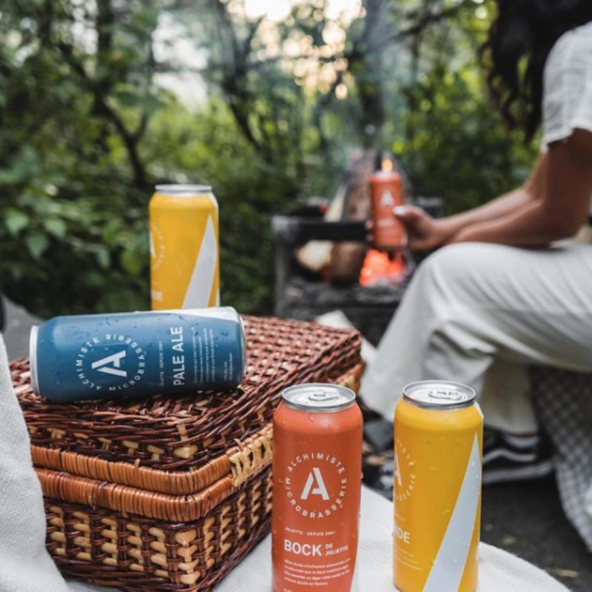
Alchimiste Microbrasserie refines its brand image and its packaging design.
Alchimiste, a microbrewery in the Joliette region, has been offering a range of carefully crafted beers for several years and its brand image has followed it to this day.
Problematic
Solution
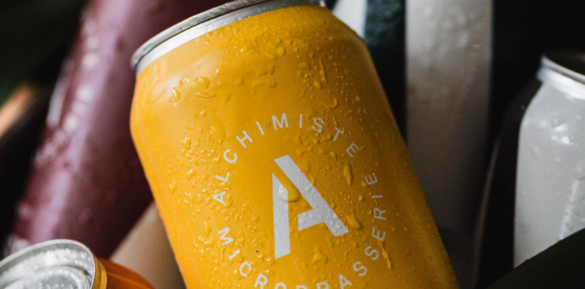
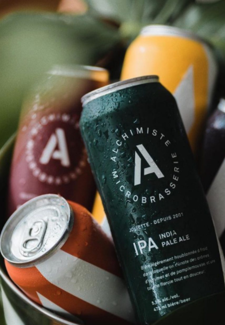
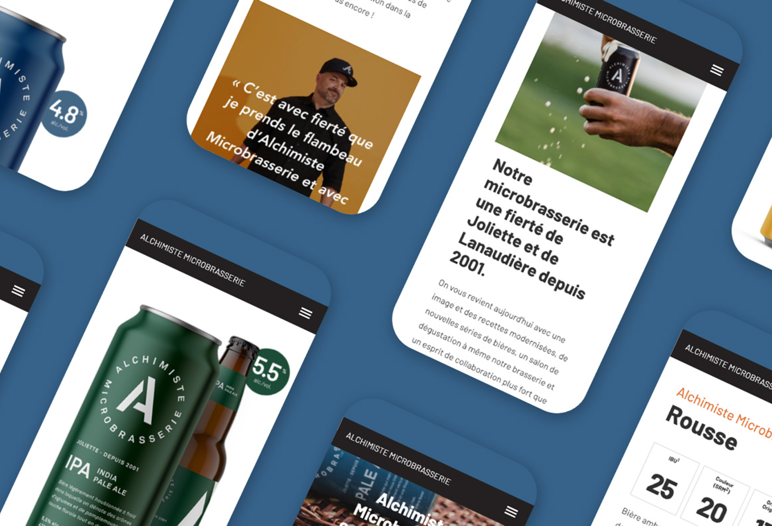
The Alchimiste brand is growing, along with its product offering and formats. With this evolution comes the need to review the brand image so that it better represents what Alchimiste has become after several years of growth. The brand wants to be distinctive on the shelves and easily recognizable by the consumer.
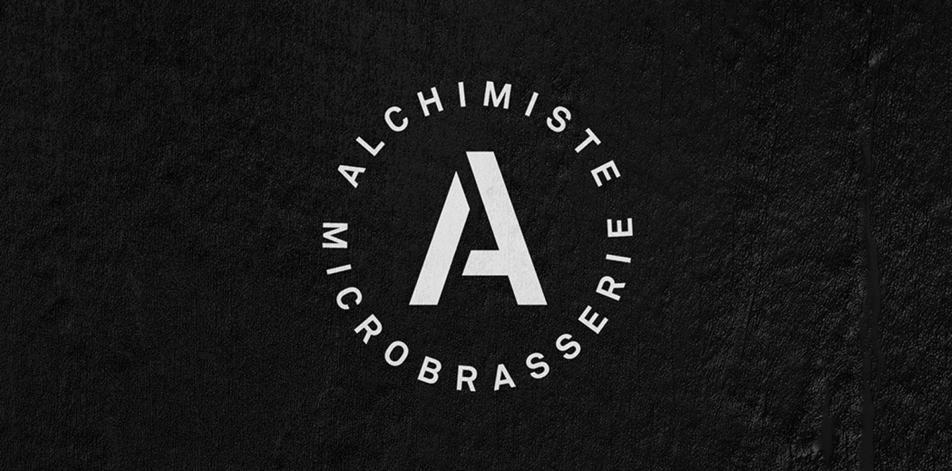
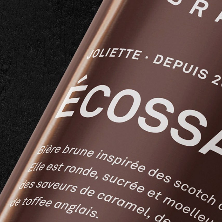
The emphasis was placed on a very representative element of the brand: the A in Alchimiste.
In contrast to the old brand image and the rather busy packaging, the new identity was intended to be much simpler and airy. With the use of a solid colour code architecture and a simple layout of the beer types, the selection is now made more quickly by the consumer.
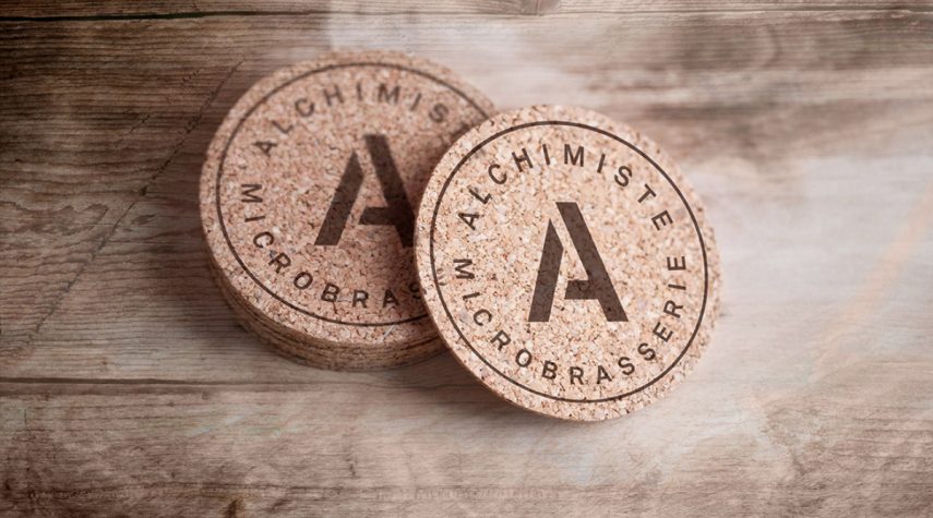
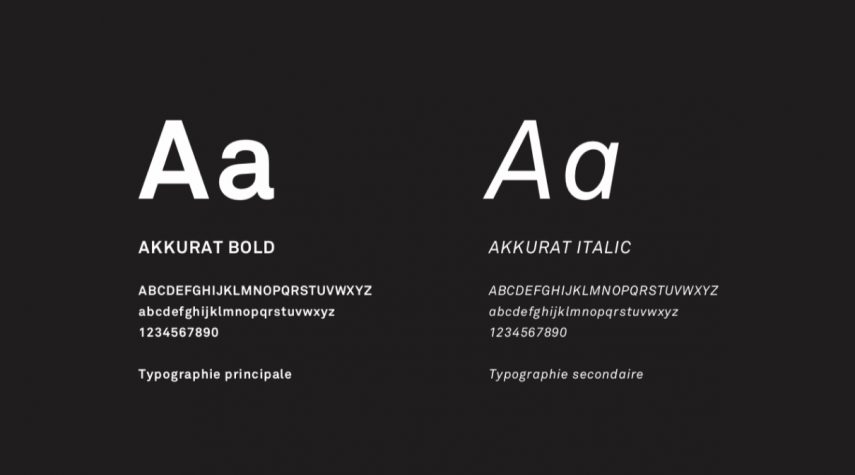
The graphic elements are now easily adaptable and usable across all communication platforms.
Because of its simplicity and effectiveness, the Alchimiste microbrewery’s brand image was named a finalist in the Créa 2021 competition.
Curious, inspired ?
Like what you see? We want to hear your ideas. Write to us to say hello and discuss your project.