7 jours
Branding
A good dose of renewal for the Dépanneurs 7 jours brand image.
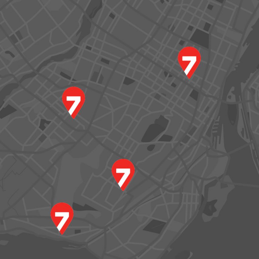
Well anchored in the culture of Greater Montreal, Dépanneurs 7 jours have positioned themselves as true landmarks among the city’s convenience stores. Wishing to stand out from the crowd of independent convenience stores, Dépanneurs 7 jours has always believed in a distinctive image.
Problematic
Solution
The Dépanneurs 7 jours brand had been under the same identity for several years. An enhanced service line was also in the works. An aging brand coupled with a new offering was hardly optimal for the brand.
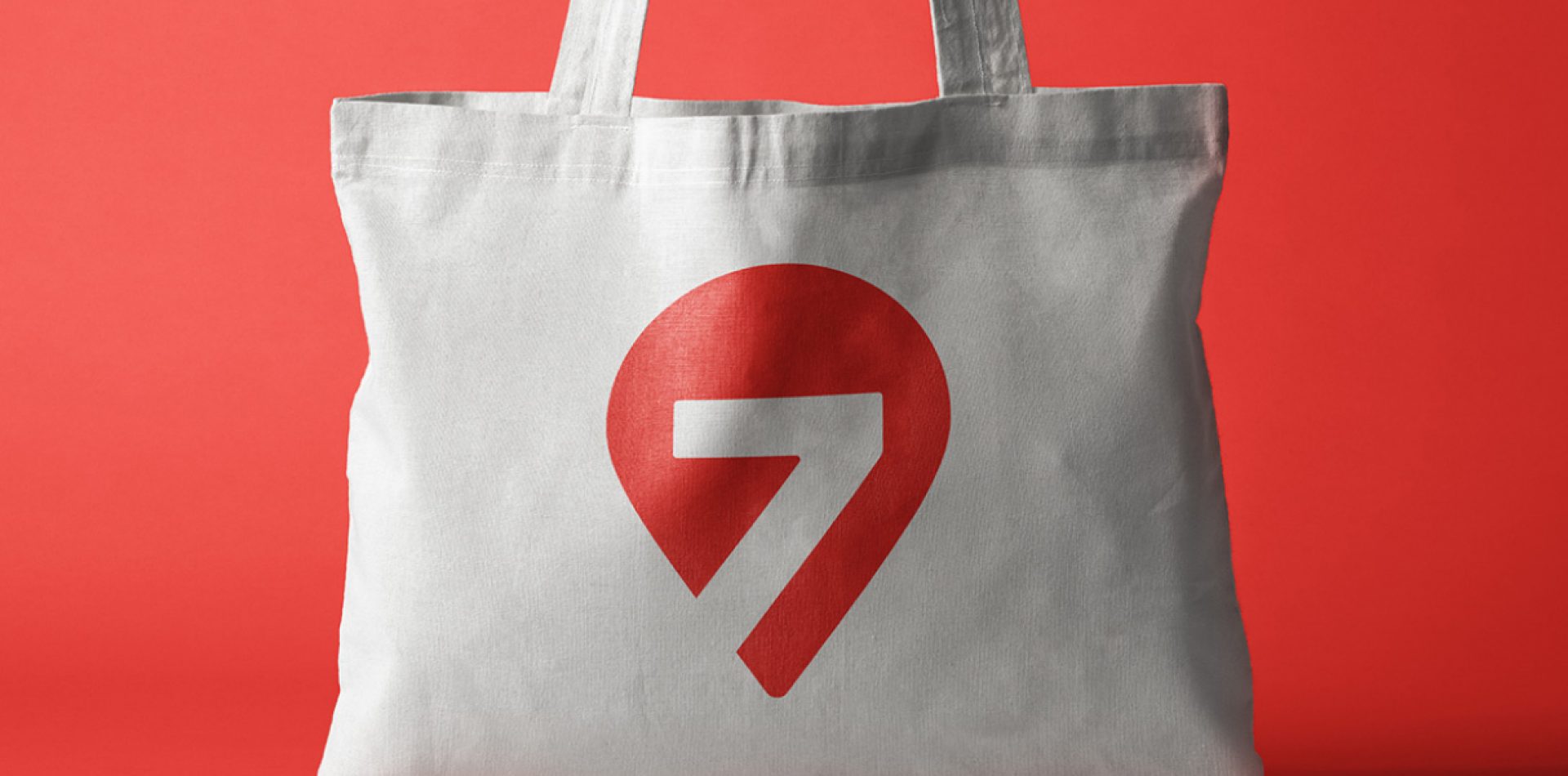
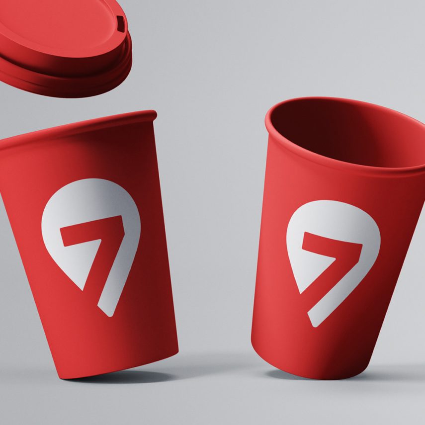
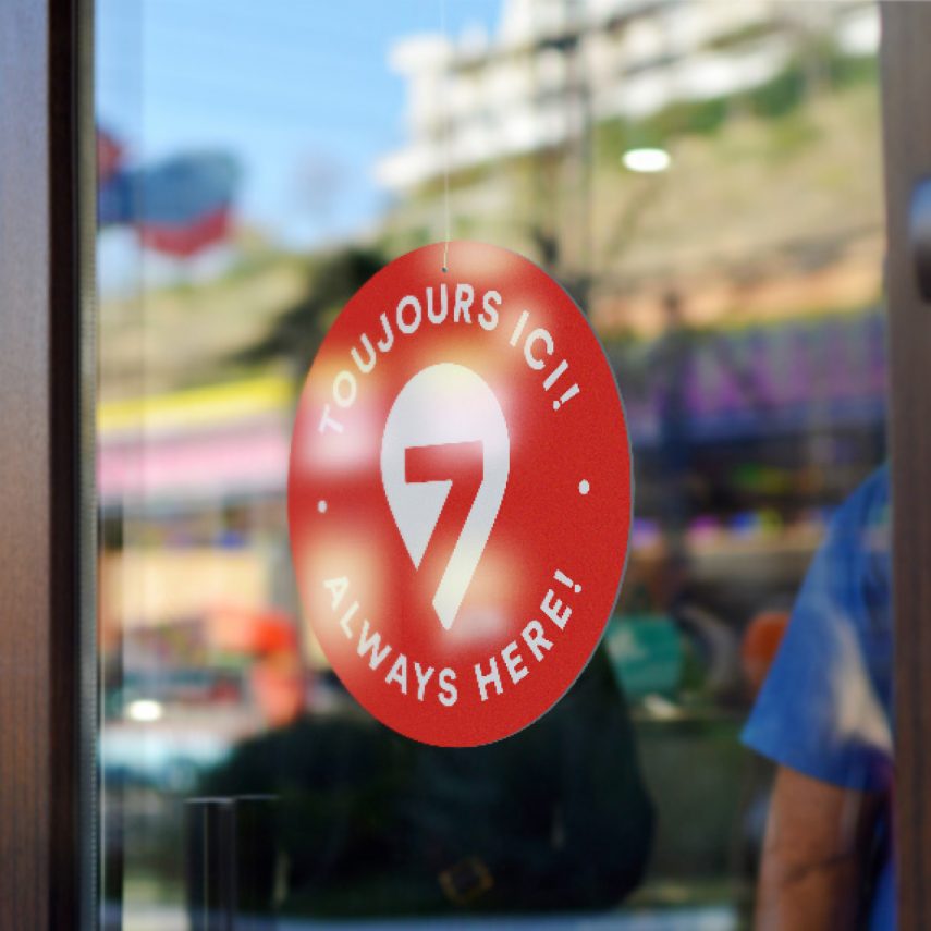
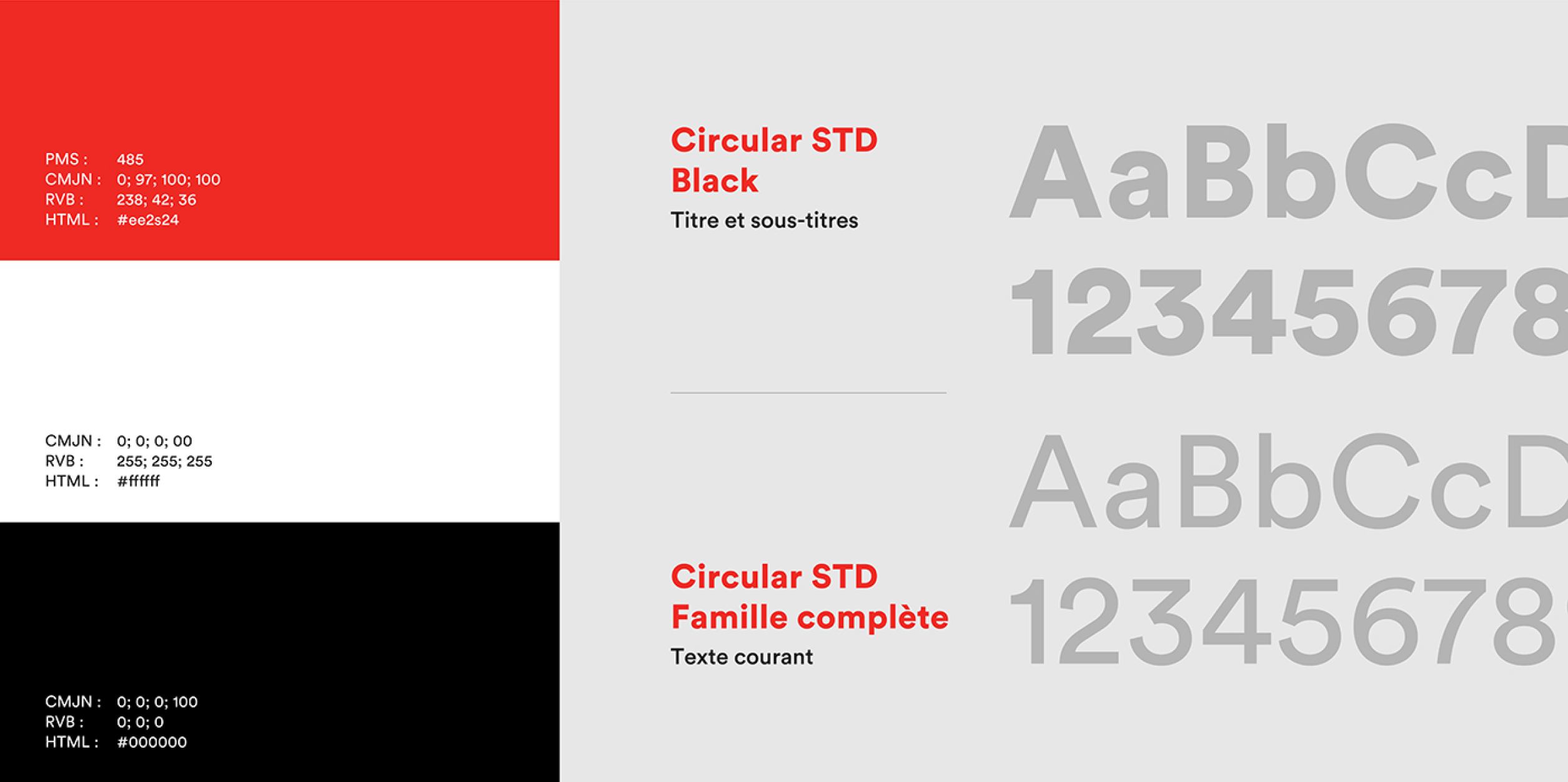
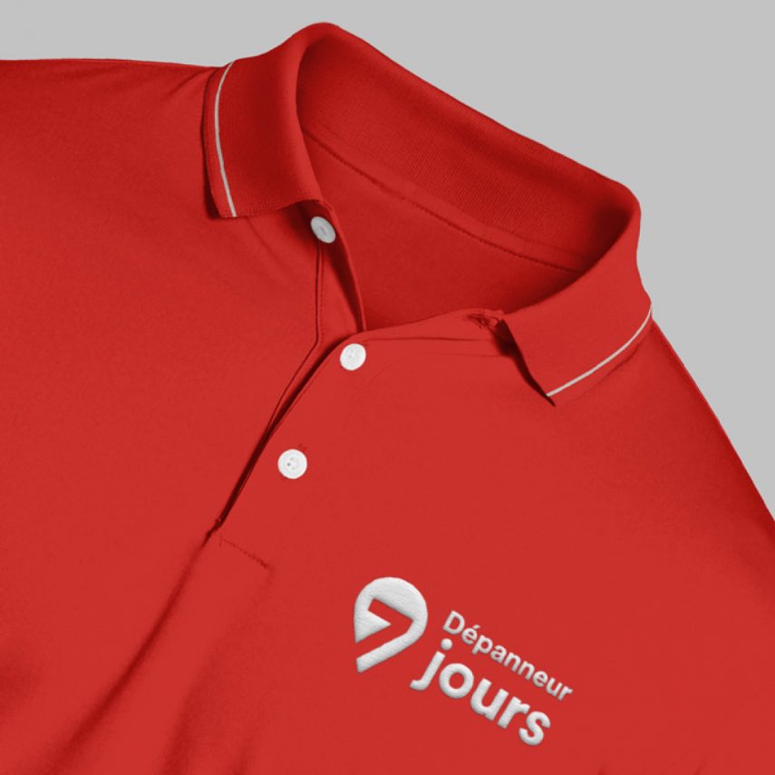
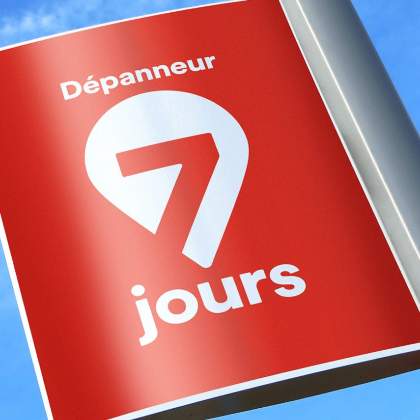
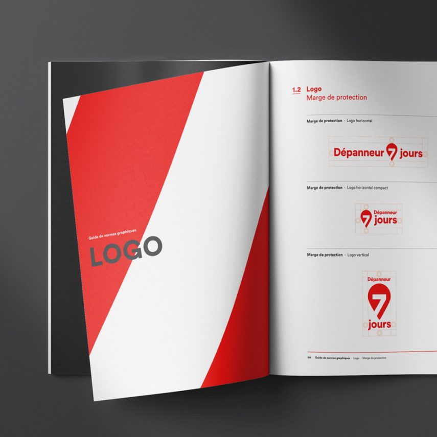
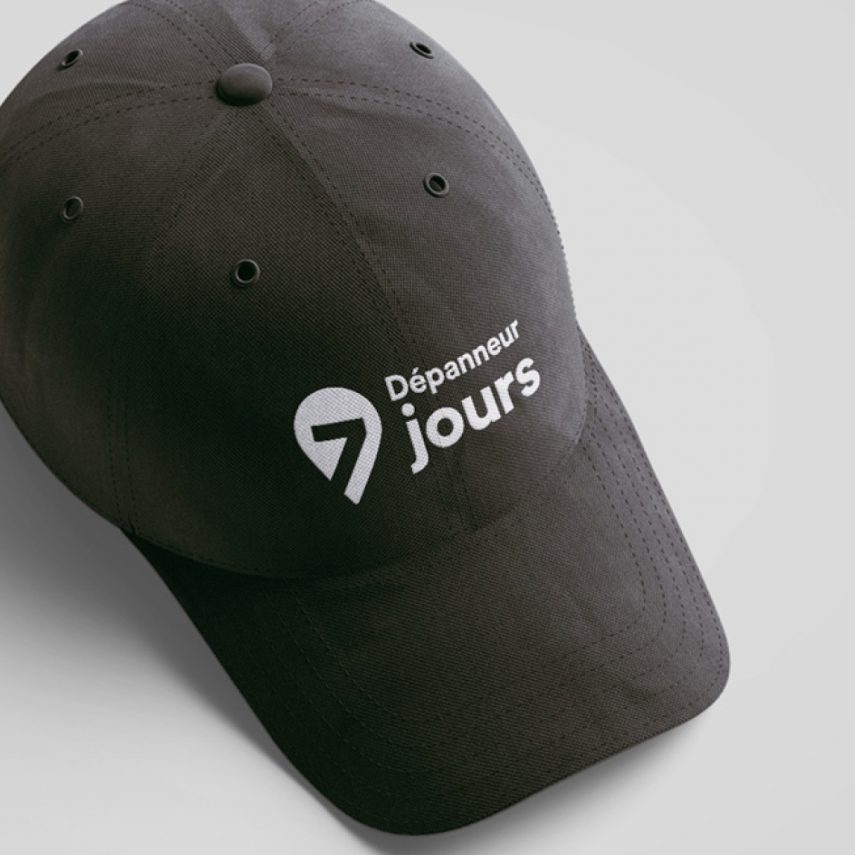
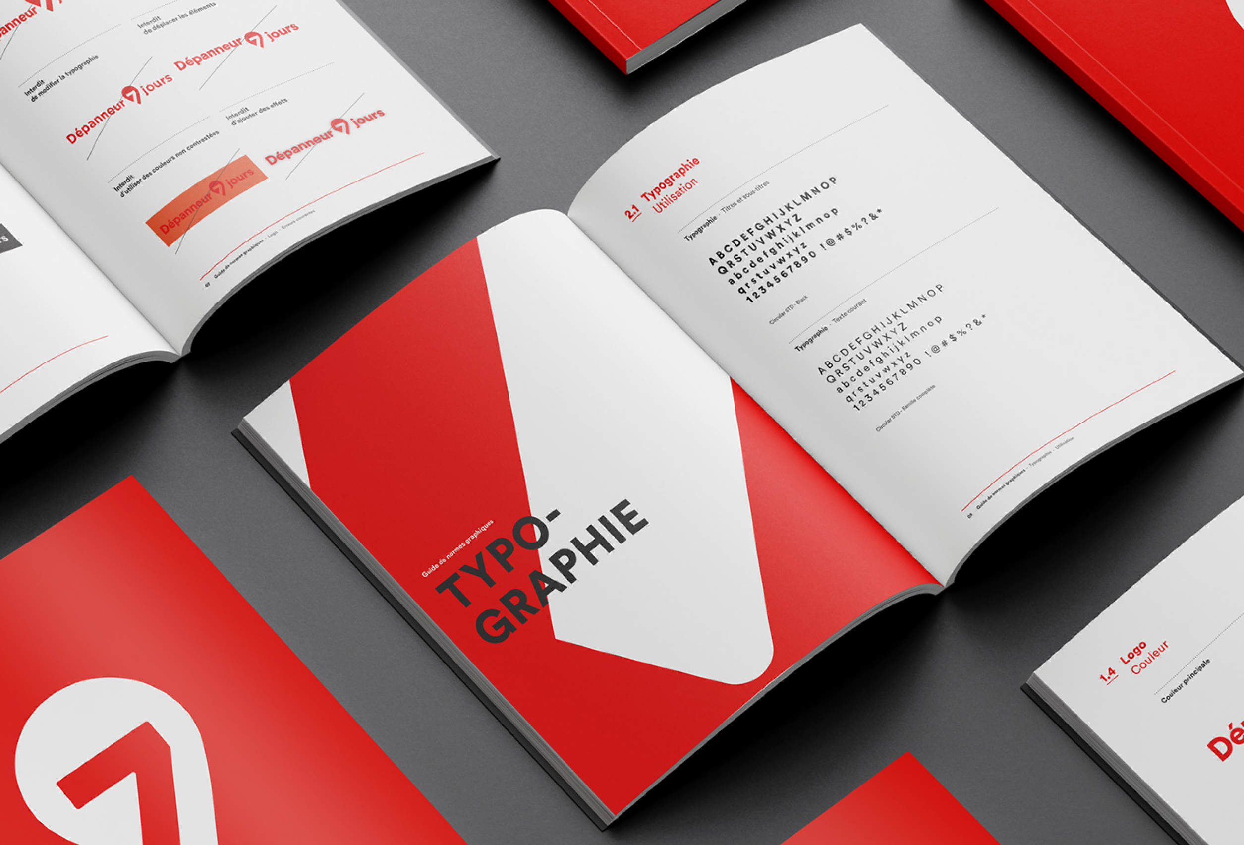
The solution was to revise and unify the banner’s brand image. For the occasion, Dépanneurs 7 jours presented their repositioning with a cleaner and more modern image, sporting a bold red.
The visual identity developed aims to unite Dépanneurs 7 jours under a single uniform label with bright and easily recognizable colours, which clearly demonstrates to customers that they will find the best accommodation services anywhere in the Greater Montreal area.
Curious, inspired ?
Like what you see? We want to hear your ideas. Write to us to say hello and discuss your project.